Best Email Signatures
What makes the best company email signatures? That’s the question we’re asked most often. Our answer – the best company email signatures are ones that are completely on-brand, compellingly engaging and call on the recipient to take action every time.
Because a signature isn’t just a professional email sign-off, it’s a valuable marketing space that you mustn’t waste. It’s your chance to make an impression through every email – so make it a positive, professional, memorable one. And when you consider that the average employee sends 1,000 emails every month, the value of a great email signature is clear.
A winning, well-designed email signature doesn’t need to be clever-clever, crowded or complicated but it should be creative, communicative and compellingly clickable.
So, what do you need to include? What can you leave out? Should you use colour? How do you get recipients to react? These – and lots of other factors – will shape your signature, and although there are no hard and fast rules (after all, rules are there to be broken), here are a few Rocketseed recommendations for creating the best email signatures.
Explore email branding solutions designed to do business.
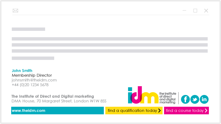
So, here are our Rocketseed recommendations for the best email signatures along with some great email signature examples:
We don’t call signatures ‘email branding’ for nothing. To be effective, everything about a great email signature needs to be on-brand, so before you start designing you need to be completely up-to-speed with your corporate brand identity design guidelines, so that everything from logos to typefaces are used correctly.
Chances are that today your email will be opened on a mobile device, so make sure your signature is mobile-friendly – that means using large enough text, large enough buttons and large enough spaces so that your signature details are easy to read and your links are easy to click on the small screen of a smartphone.
If you’re setting up signatures company-wide then they need to be consistent to build your brand. That doesn’t mean that different departments or individuals shouldn’t have different information included – for example your sales and marketing people are more likely to need social media details than your finance team. This is where Rocketseed’s tamper-proof security becomes so important, giving you central control of the ‘look’ of all employee signatures.
Avoid information overload. Too much information crowded into a signature can be counter-productive as the reader becomes overwhelmed rather than engaged. It doesn’t have to be minimalist but do you really need 8 social media icons? Edit down your signature to what’s most important so it’s easy to read, navigate and engage with. As a rule of thumb, try and keep your contact details to 3 or 4 lines of text.
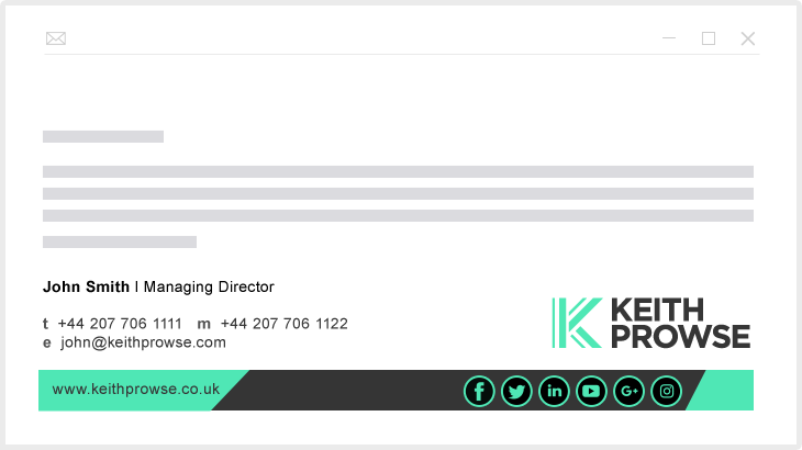
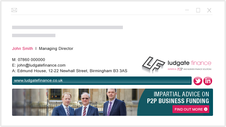
To ensure full visibility, we recommend your emails signature should be 650 pixels wide and the file size of banners shouldn’t exceed 40kb. Additionally the combined file sizes of images – which should be JPG or GIF format – within the signature should also be less than 40kb.
This splits opinion. After all, isn’t it on your email anyway? True, but emails are often forwarded on to others that have no access to your details, so by including your email address in your signature you become easier to contact.
The choice is yours. Whilst Rocketseed’s email signature design templates make it ever so simple for your marketing team to design a professional email sign-off, Rocketseed’s specialist design team will also work to your brief and manage the whole design process.
It’s important to organise your signature details into an easy-to navigate ‘information hierarchy’ so that your recipient’s eye is guided around your signature easily, picking up the information they need in the most engaging order, typically starting with your name and ending with a clear call-to-action.
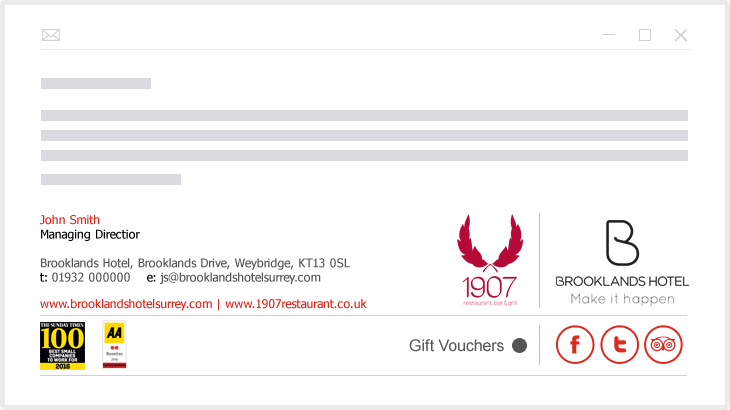
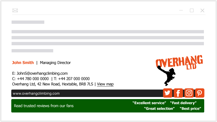
Whilst a well-designed email signature shouldn’t look ‘boxy’, lining up your contact details will help get them noticed and give your signature a sense of balance. We recommend that you take alignment cues from the position of your logo, and it’s worth remembering that left-hand text alignment is the easiest format to read.
Whilst your company might have a motto that makes a professional-sounding sign-off to your signature, it’s worth avoiding ‘comic’, ‘controversial’ or ‘inspirational’ quotations – at best you’ll seem corny, at worst offensive – and that could cause you problems and cost you customers.
Colour in a well-designed email signature always catches the eye but be careful with combinations and clashes. Too many colours can make your email signature look childish, so, unless your logo is a rainbow, it’s best to stick to a couple of key colours from your brand guidelines palette. That way your signature will match all your other branded collateral. If your signature is black and white, a flash of eye-catching colour can be sure to make it that bit more eye-catching.
When it comes to fonts, it’s best to make sure they’re web-safe, stick to one or two that meet your brand guidelines. To ensure readability we recommend using a font size of 10pt as a minimum. You can create variety by getting versatile with just a single font – sizing up and down, upper and lower cases, bold, italics and, of course, adding colour (as long the colour meets your brand guidelines) – which make your signature more engaging. But remember, by choosing web-safe fonts will your signature display as desired on all devices.
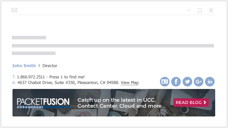
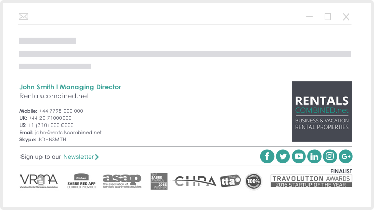
You don’t want your signature looking like a collage, so go easy on the graphics. Try to resist adding more than 2 images, or another graphic if it’s going to detract from your logo. Also, make sure your images are embedded. This is easy with Rocketseed and ensures that each image displays as desired to recipients, rather than being attachments that display as red corner crosses and require downloading (by which time all your signature’s impact and professionalism is ruined!)
To add a photo or not? There are pro’s and con’s so the choice is yours. Sure, a photo can make your signature more personal and, if you’re client-facing it can help put a face to a name.
Your email signature is a great way to drive social traffic, it is increasingly expected and easily included by featuring clickable social icons in your signature. Unless you regularly use a wide range of social media professionally, we recommend that you include the three or four social channels that are most important to building your business and make sure they are actively managed and kept full of engaging, relevant content.
How best to feature your social icons in a well-designed email signature? Whilst they can be designed to match the brand style of your signature, social media icons are more likely to be recognised and clicked if you keep them looking familiar in their default styles and colours.
No matter how good your email signature design, if you’re not measuring the clicks on your links, what’s the point? With Rocketseed it’s easy to make every link trackable, and you can A/B test different signature elements to see, for example, which call-to-action performs best over time.
Your finished email signature looks great to you – but will it look the same to your recipients? Before you start sending it out on every email, it’s time to test it – so send it to different devices and email clients – and when you’re confident it renders correctly every time, you’re good to go!
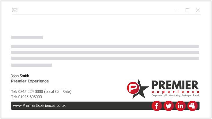
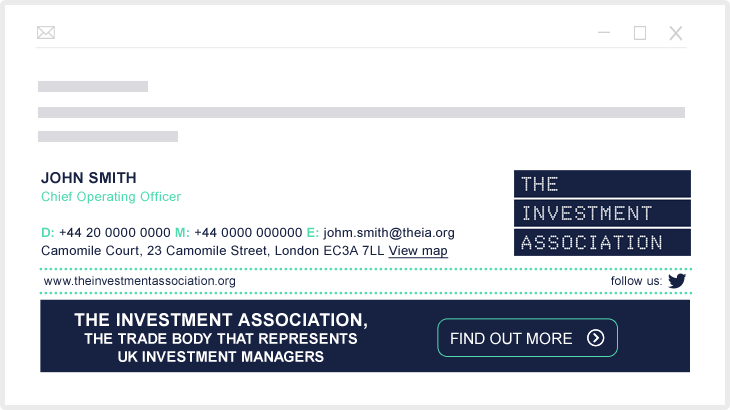
You’ve caught their eye, you’ve communicated your details, now you need your reader to act – and that needs a crystal-clear compellingly-clickable call-to-action (CTA). From booking a demo or downloading an ebook to signing up for a newsletter, a strong call-to-action is a must-have. So what makes a good call to action? You can make your CTA immediately eye-catching by experimenting with colours and font sizes but be sure to keep it short, simple, compelling (but not pushy or ‘salesy’).
Your signature is the perfect place to promote your company’s marketing content with links to blog posts, ebook downloads, newsletter sign-ups, videos and more. In fact, signatures can give a new lease of life to marketing collateral that had previously received much smaller circulation and which can now become part of your email signature marketing campaign. But don’t keep the same content message on your signature for too long – even the best campaigns get stale.
It’s important that your email meets any legal requirements that apply to the region in which you’re operating or your business sector. There’s a whole set of Rocketseed best-practice do’s and don’ts for disclaimers (which you can find here) and we always recommend you take legal advice. We also recommend that you place any disclaimer below your email signature and, as always, try to keep it simple so that there isn’t too much ‘small print’ to distract from your signature.
A signature isn’t a big space so space dividers are valuable in breaking up your information and directing the eye around your details. If you’re concerned that your signature is getting crowded try some colour variation in your text or use vertical bars (pipe glyphs) to break up any long lines. This way you can get a lot of information in a small space without compromising design and can keep your contact information distinct from your call-to-action or disclaimer.
We hope this answers some of your questions about what helps to make the best company email signatures. These are recommendations, not rules, so it’s worth experimenting to see what works best for you… and we’re always here to help.


